

He/Him
Ryder

Motivated engineering student with experience in collaborative projects, prototyping, and analysis. Skilled in communicating design ideas and STEM with a growing portfolio of academics and service.
Motivated engineering student with experience in collaborative projects, prototyping, and analysis. Skilled in communicating design ideas and STEM with a growing portfolio of academics and service.
Endorsements
Verified
About Me
University of Colorado at Boulder
Class of 2027
Arapahoe Community College
Associates Degree in Science
University of Colorado Boulder
Aerospace Engineering
Parker, CO, USA
Skills
Creativity
Communication
Leadership
Interests
Fashion design
Business
Aerospace engineering
Brands I Follow


+3
My Portfolio

Interview Questions
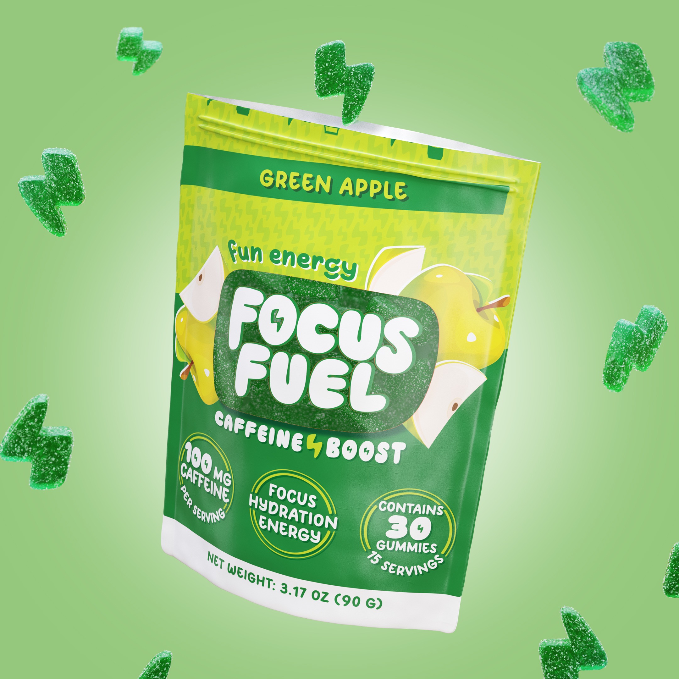
FocusFuel
UGC Content Creator - Colorado
What brands do you admire?
I admire all brands that support healthy and active lifestyles without sacrificing creativity and passion. I would say UGC aligns perfectly with what I value.
FocusFuel
UGC Content Creator - Colorado
Are you familiar with Colorado’s Yoga on the Rocks event?
Yes!
FocusFuel
UGC Content Creator - Colorado
What makes an effective UGC video for an energy and lifestyle brand?
a rebellious and spontaneous natured video that values energy and creativity. I can leverage summer break from college to create an immersive and captivating video that aligns with UGC core principles.